US Bank — Mobile App UX
Mobile app UX across devices for US Bank — a personalized, location-aware account experience, tested with real users and pushed as far as an early Google Glass exploration.
Overview
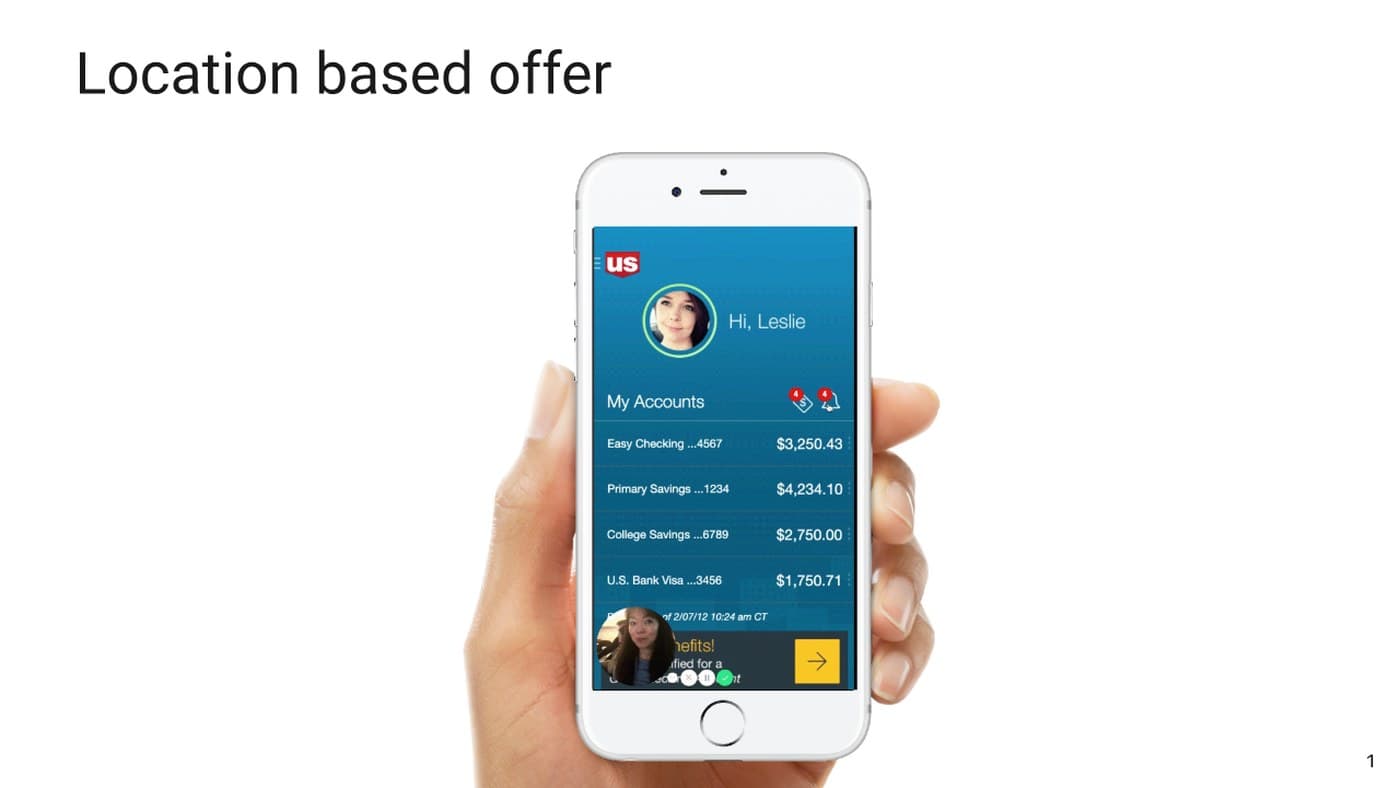
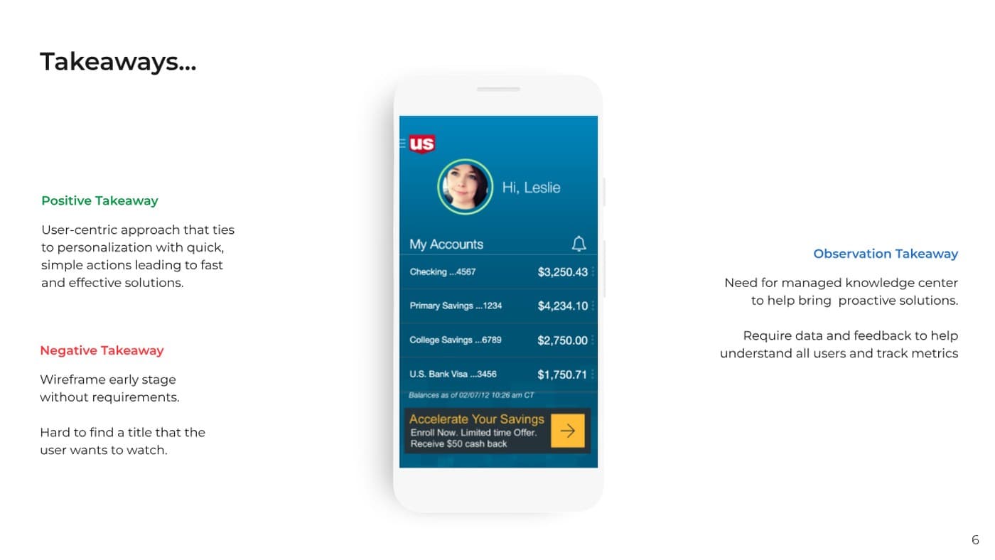
A location-based offer experience for the US Bank app — surfacing a personalized account view (“Hi, Leslie”) with balances across checking, savings, and college fund accounts at a glance.
Approach — Flow
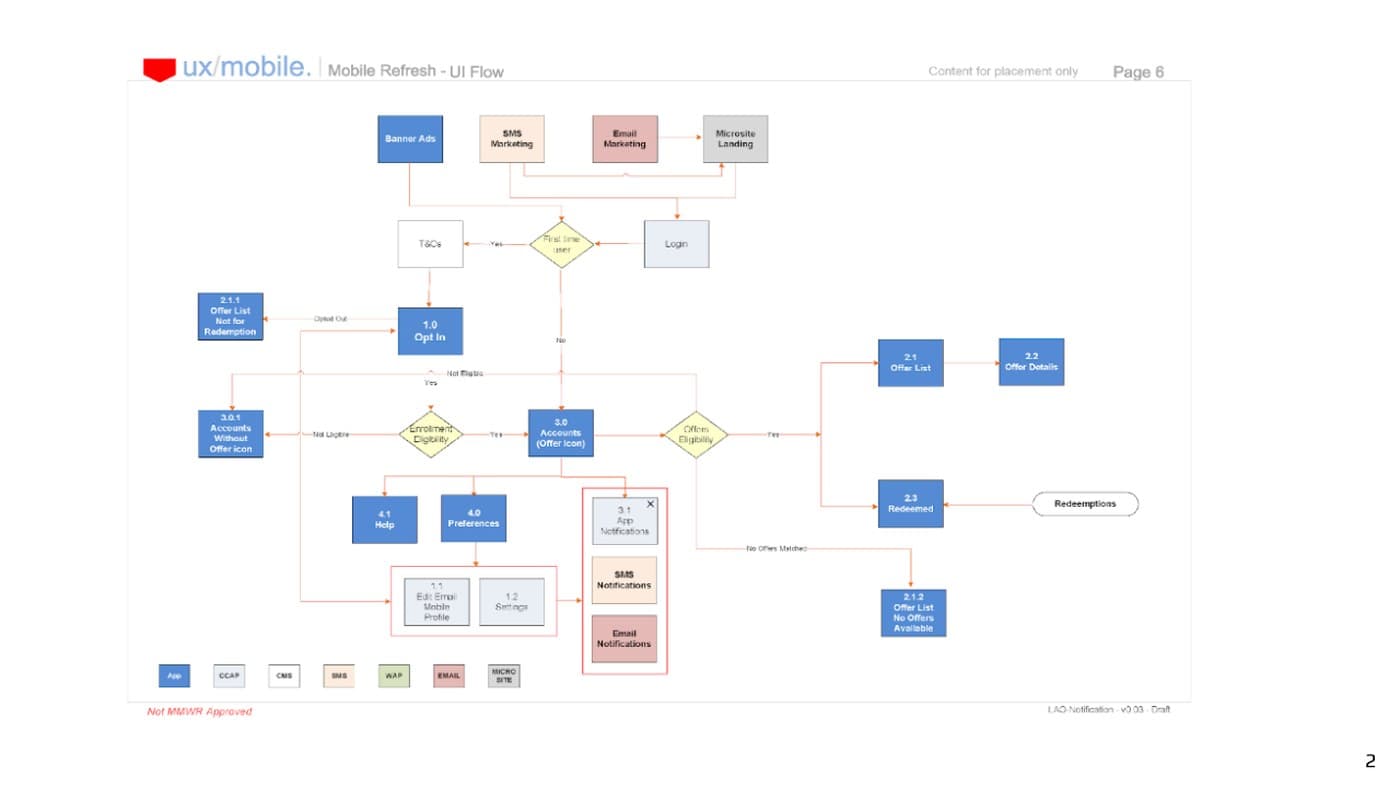
The mobile refresh started from a full UI flow diagram, mapping every decision point from login through account actions before any screen was drawn.
Screens — Mobile Refresh
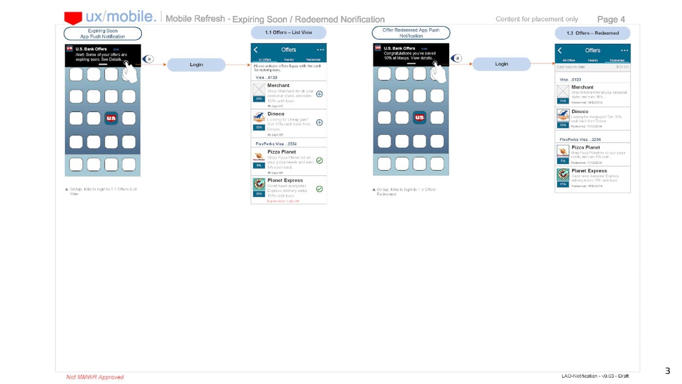
The refreshed UI carried login, account list, and bill-pay screens forward with a consistent visual system.
Usability Testing & Takeaways
Two personas were tested hands-on with the working prototype. The positive takeaway: a user-centric approach tied to personalization, with quick, simple actions leading to fast and effective solutions. The observation takeaway: a need for a main page or knowledge center to help surface proactive solutions, and a need for more data and feedback to understand all users and track metrics.
Exploration — Google Glass
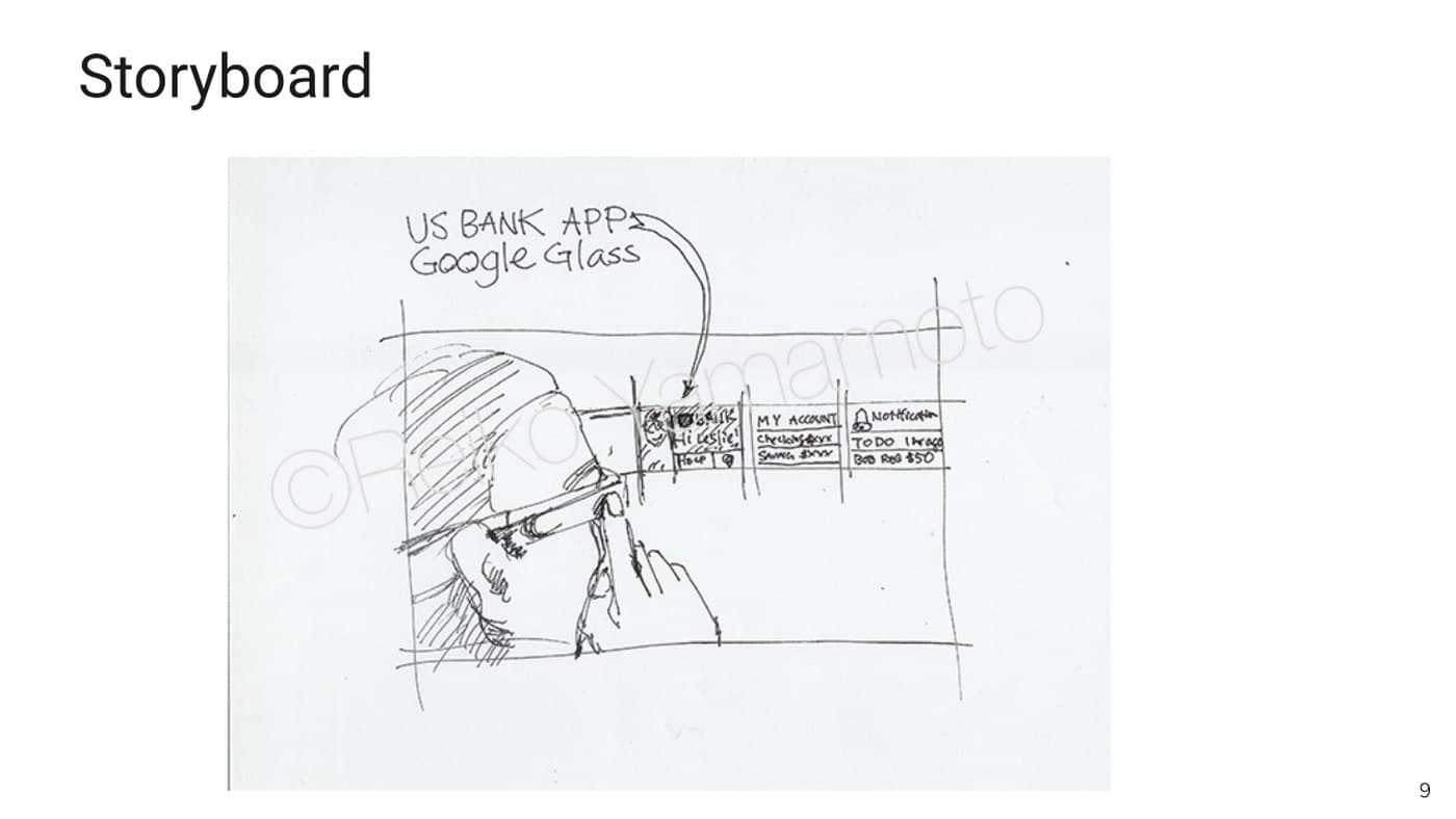
Beyond phone and tablet, an early storyboard explored what a US Bank account glance and login could look like on Google Glass — voice-first, hands-free account checks.
Outcome
Mobile design standards and accessibility patterns established for the US Bank app, validated with real users through usability testing across two personas.