Takara Sake Tasting App
A mobile sake-discovery app for a 100-year-old sake brewery, designed end to end in Figma and shipped as a working React app — from tasting-room discovery to a lead-capture flow that turns a single pour into a Sake Club member.
Takara Sake USA has been brewing in Berkeley since 1919 — a real tasting room, a real pouring staff, and a catalog that runs from an everyday junmai to a limited daiginjo. What it didn’t have was a digital layer connecting the two: a way for someone standing at the counter to actually remember what they liked.
I designed and built a mobile companion app that starts at the pour and follows the drinker home — a discover feed, guided course flights, a tasting journal, and a taste profile that gets sharper with every note logged — plus a separate lead-capture flow for the events where most first pours actually happen.
Problem
A tasting-room visit or a pop-up event is a great first impression and a terrible memory aid. A guest samples four or five sakes in twenty minutes, loves one of them, and has no way to hold onto which one — no notes, no photo of the label, no path back to it later except “the blue bottle, I think.”
Takara’s existing digital presence was a standard e-commerce storefront — built for someone who already knows what they want, not for someone deciding what they liked. And at live events, a QR code that drops a stranger straight into a signup form has no way to say “not right now” gracefully, and no reason for them to come back after they claim the one-time offer.
Solution
Two connected surfaces, each doing one job well: a discovery-and-journaling app for the ongoing relationship, and a lightweight lead-capture flow for the moment someone’s standing in front of a pourer with a phone in hand.
Discover feed
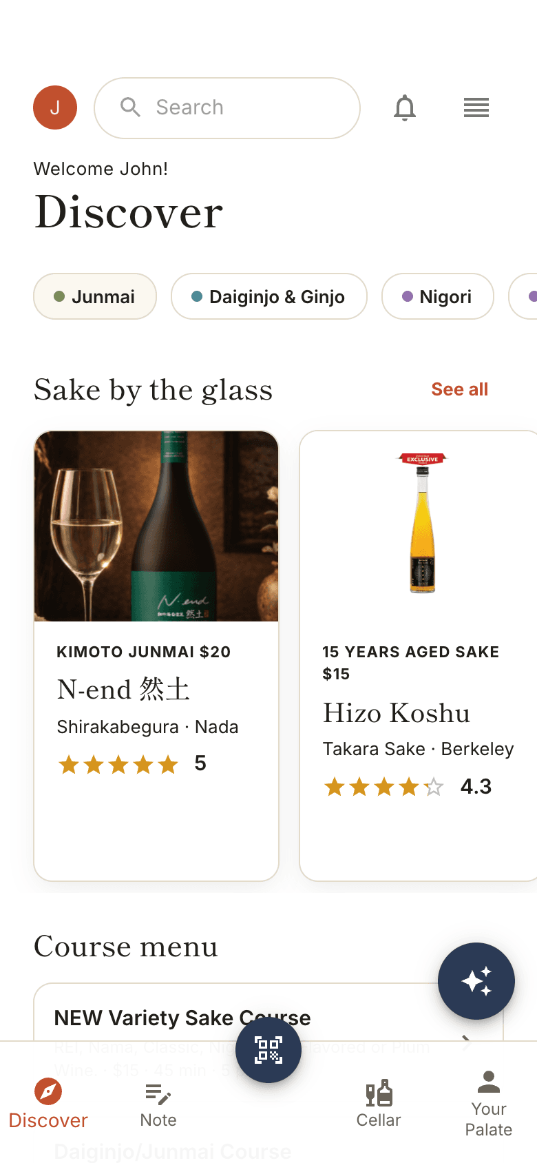
Category filters and real bottle photography, browsable before you've even sat down at the tasting room.
Course flights & detail
Every pour gets a detail screen — essentials (SMV, acidity, polishing), region, and a flavour radar aggregated from tasting notes.
Tasting journal
Structured logging: star rating, serving-ritual sliders, flavour chips, and free-text notes — built to be filled out with a glass in your other hand.
Taste profile
Notes roll up into a taste persona and palate-lean charts, so the app gets more personal the more you use it.
Sake Club & Cellar
Membership QR code, saved bottles, and a home for the relationship that continues after the visit ends.
Lead capture flow
A separate companion app for in-person events: QR code → 2-step form → account creation → Sake Club upsell, shipped as its own Next.js deploy.
Figma · UI Flow Creation
Before a single screen was drawn, I mapped the landing flow end to end — from a scanned QR code through the decision points that actually determine whether someone finishes: decline gracefully (a real, designed “no thanks” path, not a dead end), skip account creation and go straight to the tasting room, or create an account and land in the Sake Club funnel. Naming those branches up front is what let the lead-capture app’s decline screen and guest path ship without being an afterthought.
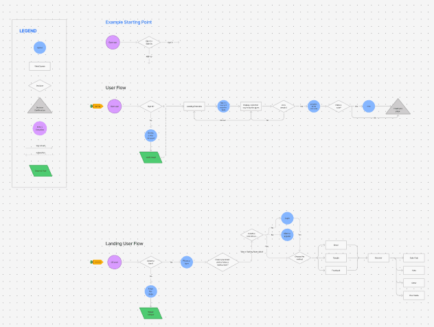
Landing user flow — QR scan through account creation, method choice, and into Discover, Sake Club, Note, and Cellar.
Figma · Wireframes & Mockups
The four core screens — Discover, Sake Detail, Tasting Journal, and Taste Profile — were built in Figma on a Material 3 component sheet skinned to Takara’s own palette (persimmon, indigo, warm tan) before a line of React was written, so the production build could match the file exactly instead of reinterpreting it.
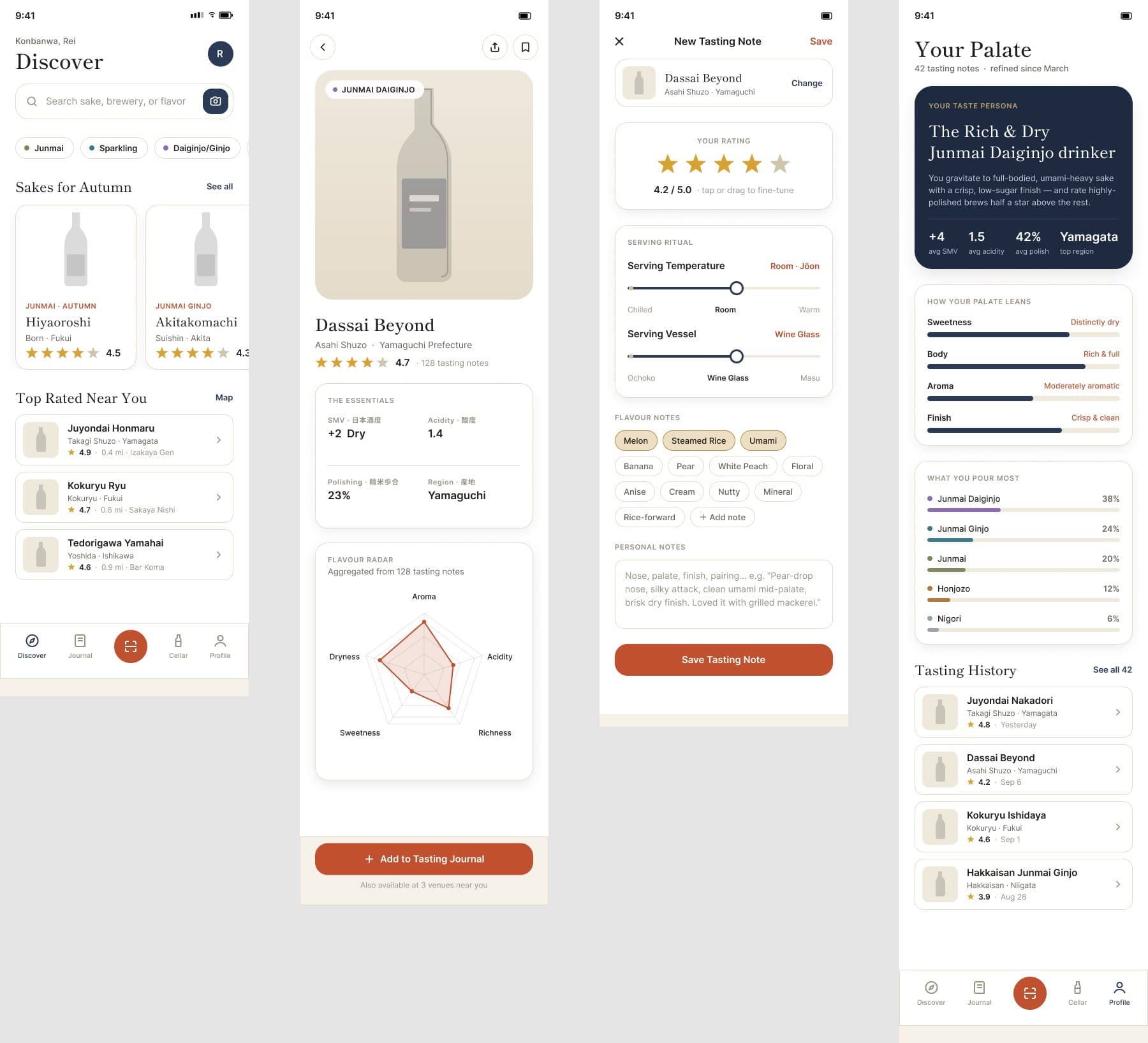
Discover → Sake Detail → Tasting Journal → Taste Profile, as shipped.