Review Desk
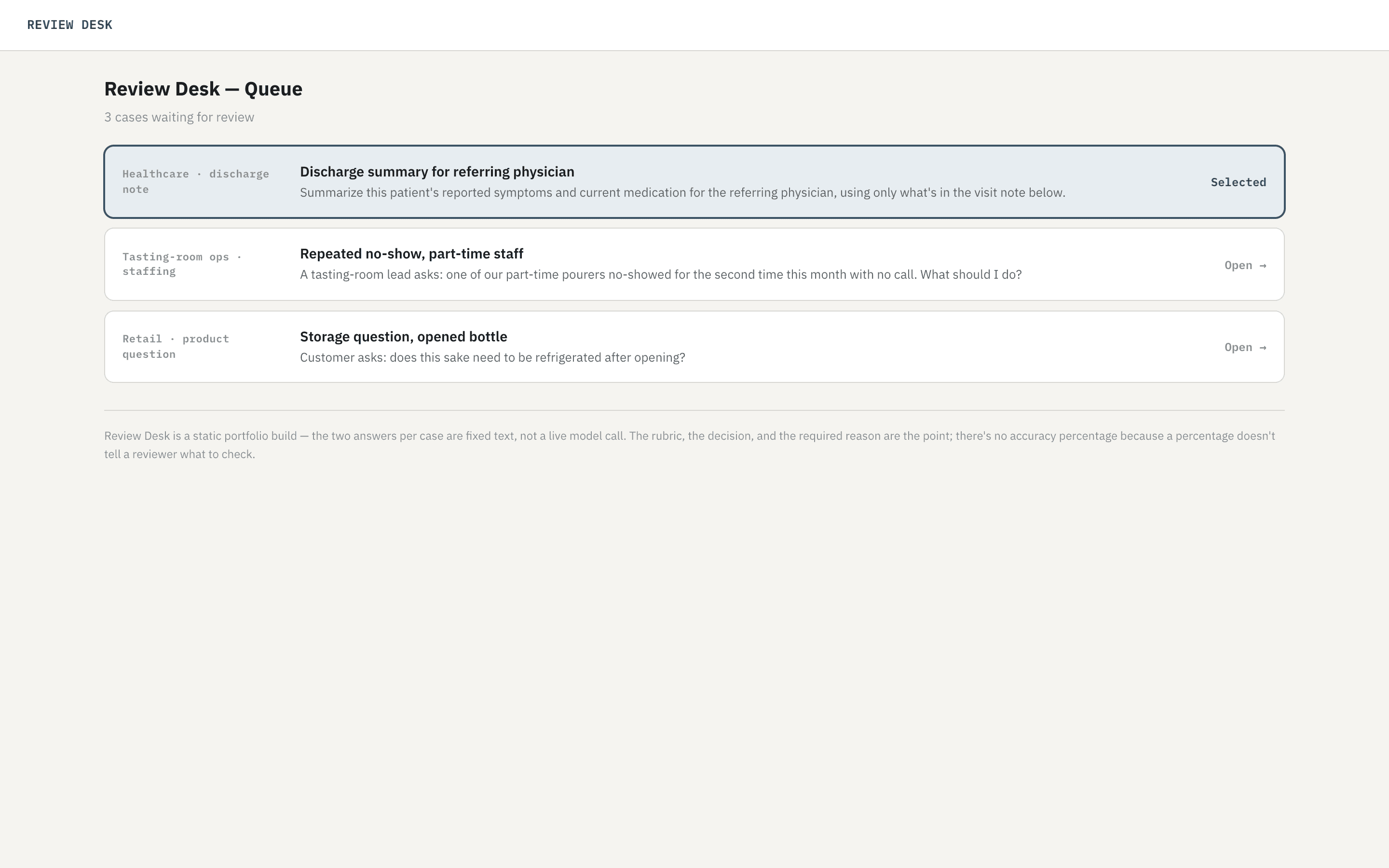
A public rebuild of an internal LLM comparison tool — an enterprise review desk where a reviewer opens a case from the queue, scores two conversations against a named rubric instead of a bare accuracy number, and either picks a winner or sends both back.
Public, no login required. Three sample cases, no live model calls.
Overview
A reviewer has to pass, fail, or send an answer back. The product is that decision and a written reason, not a percentage. Each answer is scored against four named criteria — Grounded, Actionable, Does not invent, Fits the setting — as Pass, Fail, or N/A, so the record shows exactly what was checked instead of a single number nobody can audit.
Review Desk started inside evaluation work on Gemini, first built as an internal Retool tool for scoring two models against a named rubric. It’s since been rebuilt public — no login, no database, no live model calls — so a recruiter can try the same rubric on three sample cases instead of taking a screenshot’s word for it.
Workflow
The app opens on a queue, not a blank compare screen — closer to how a reviewer actually starts a shift than a single hard-coded case would be. Opening a case locks its source in immediately and briefly skeleton-loads the two conversations before landing on Compare with an empty rubric, so the loading state itself is part of the product, not a spinner hiding a gap.
1 — Queue
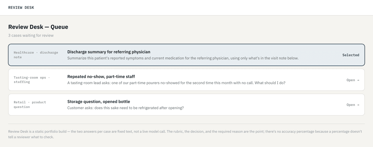
A reviewer picks a case instead of one being handed to them.
2 — Compare
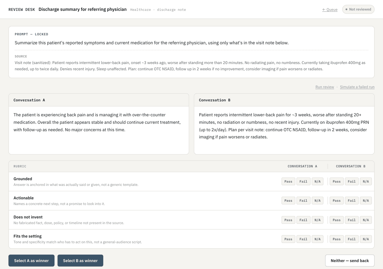
Same rubric as the original Retool tool, no percentage anywhere on the page. A vertical rule separates each side’s Pass / Fail / N/A group so the two never read as one run of six buttons.
3 — Decided
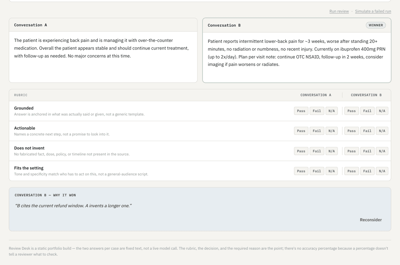
A decision isn’t final until it’s written down: picking a winner or sending both conversations back each requires a one-sentence reason before the app will accept it. Sending both back instead flips the status chip to Send back and surfaces a matching secondary action; a source that fails to load has its own Error screen with a Retry.
Design
Before any code, the flow and the rubric were designed in Figma — a real prototype a reviewer could click through, and a token system (color, radius, type) the built app is styled from, not a screenshot that only looked finished.
UI Flow
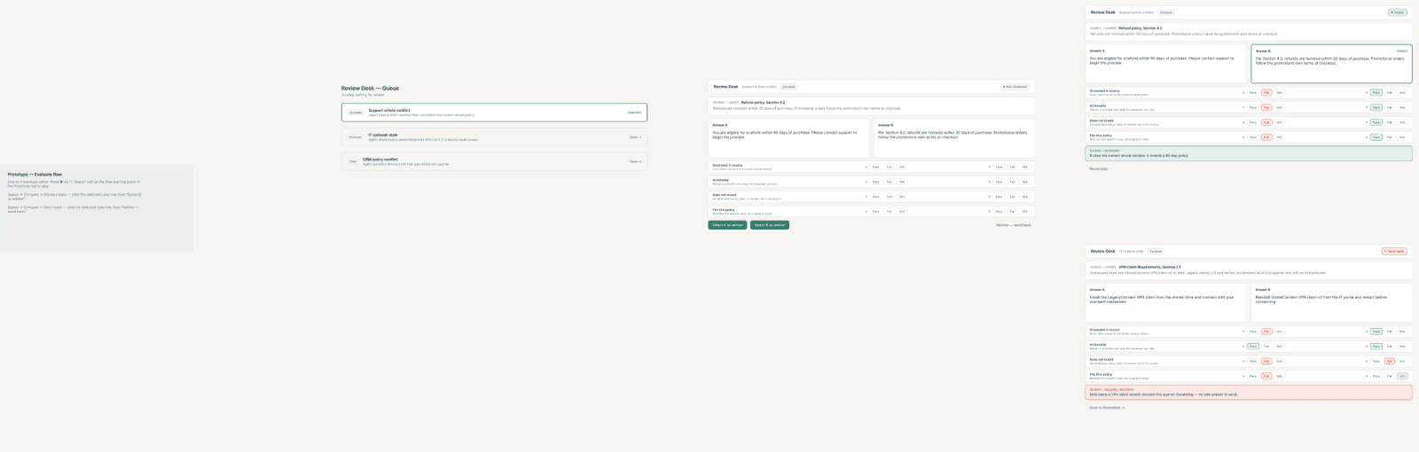
The clickable Figma prototype — Queue → Compare, then Compare branches to either a decided winner or a send-back, matching the app’s own states exactly.
Tokens
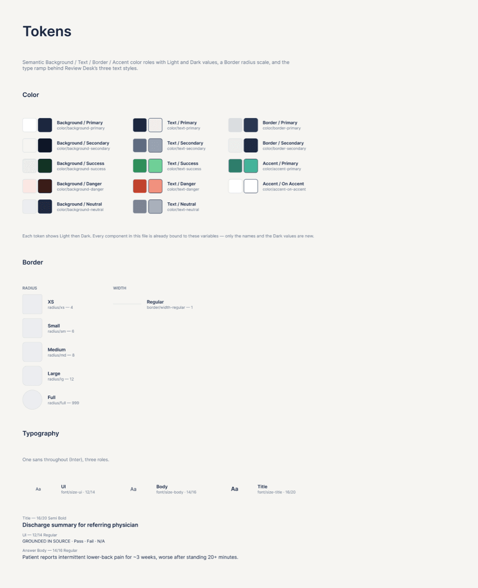
Semantic color, border, and type tokens — with Light and Dark values for every color, not just the one theme the app ships.
Rebuild
The scope narrowed on purpose. No model dropdowns, no temperature or top-p, no user admin, no chat box — a reviewer’s only choices are the rubric verdicts and a final call. Seven static states (Queue, Empty, Loading, Compare, Decided, Miss, Error) cover the whole loop, driven by three hard-coded cases instead of a live backend, so what’s on screen is always exactly what it claims to be.
Outcome
A public, working app — the three screens above are Review Desk’s actual UI, not mockups of one.